UI Screens
Calvary Hospital · Platform
Calvary is a national Australian healthcare provider operating hospitals across the country. Patients entering the system faced paper-heavy admissions, arrived underprepared for procedures, and had no digital access to their care journey. Families were reliant on phone calls to an already-stretched reception team for basic updates about loved ones.
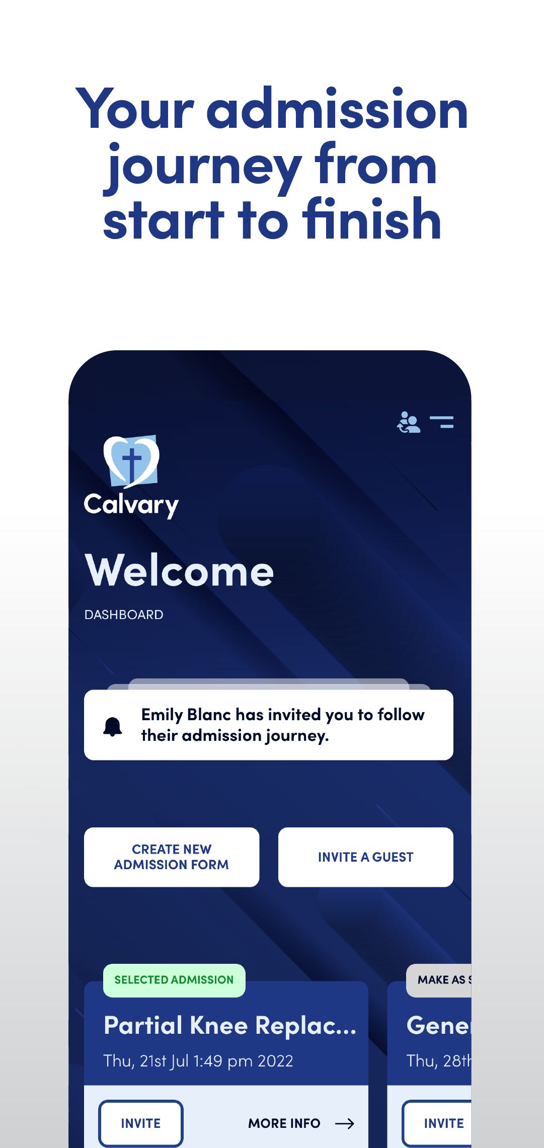
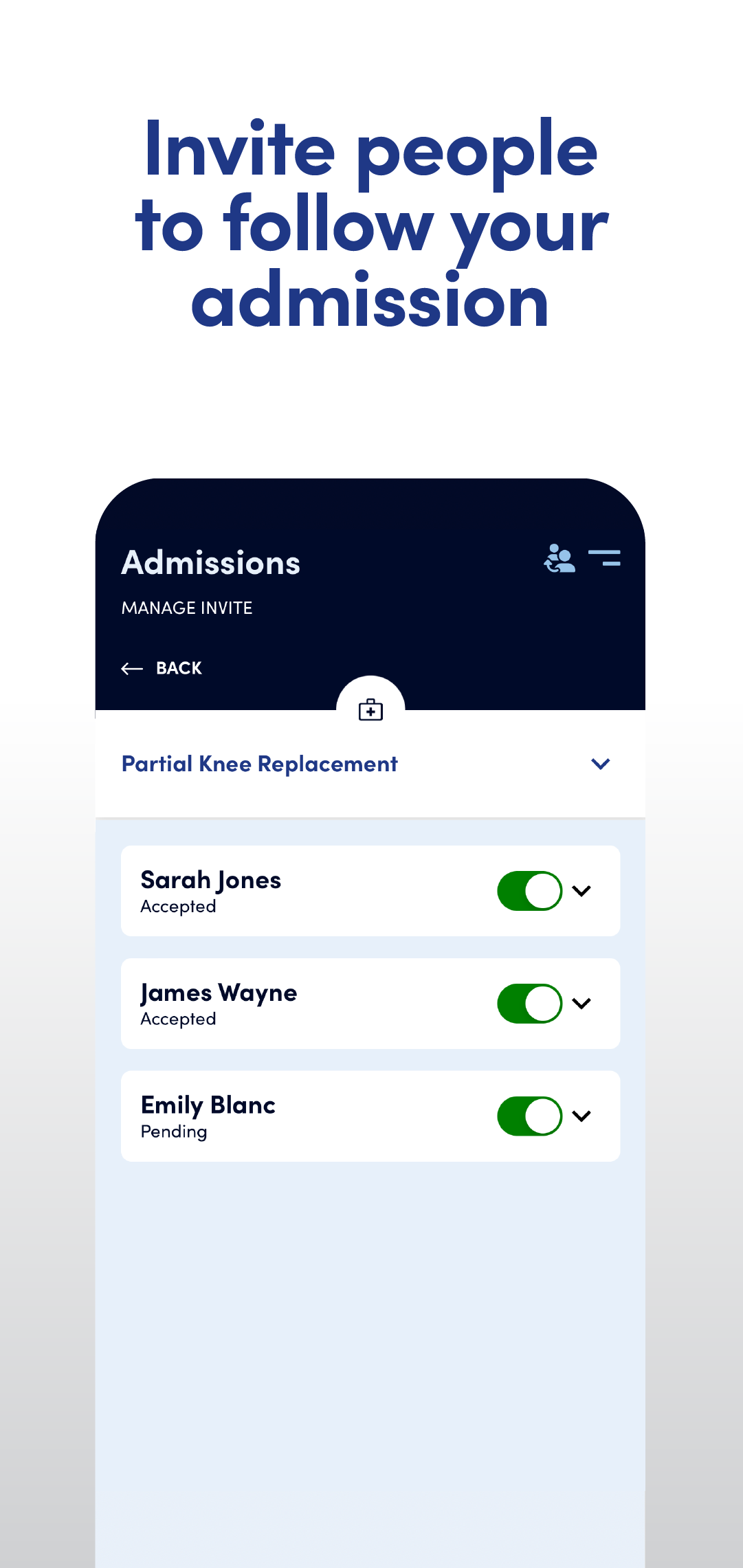
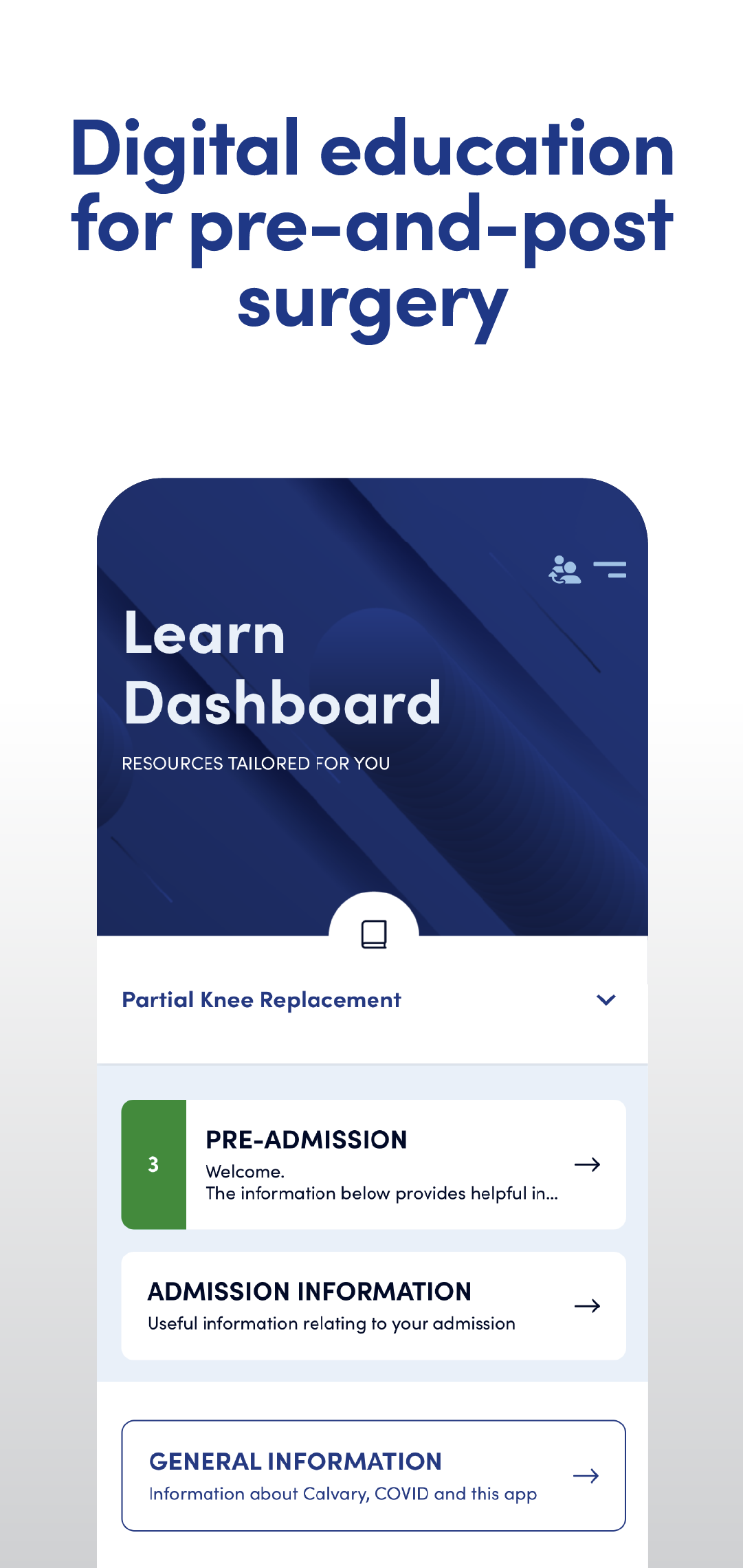
A companion app that digitises the admission process, delivers procedure-specific patient education, and gives families real-time visibility into surgical status — reducing administrative burden and improving the care experience across the network.
Designing for an exceptionally wide user range — from elderly patients with limited digital confidence to tech-savvy family members managing care remotely — while maintaining clinical accuracy, accessibility, and Calvary's calm, trusted brand.
An information-poor and communication-dependent process was creating a poor brand experience for staff and families with no visibility into the care journey of loved ones.
"In five years, CalvaryCare will be the leading digital companion for hospital patients across Australia — seamlessly connecting individuals, families, and healthcare teams through every stage of care, making admissions effortless and empowering users with real-time information."
Enable patients to complete admission forms electronically, reducing paperwork and day-of administrative delays.
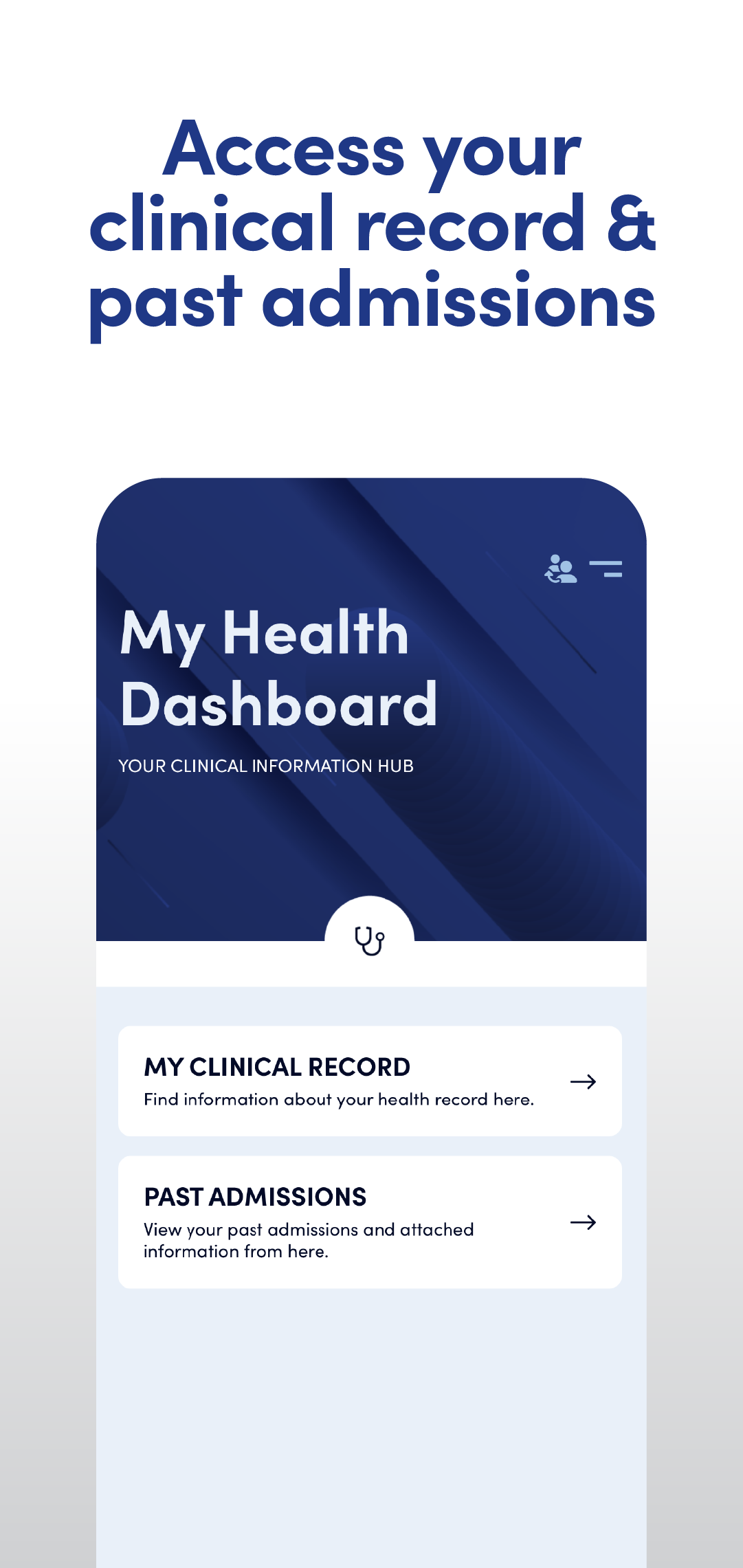
Provide access to clinical records, procedure-specific education, and real-time care journey updates from a single mobile platform.
Offer wayfinding maps, specialist directories, and surgical status sharing with loved ones — reducing family calls to hospital staff.
We reviewed Calvary's existing product workshop discovery and worked collaboratively to translate user journeys and clinical insights into a seamless UI experience. Designs were reviewed and iterated through multiple rounds with key stakeholders including the board, general manager, and clinical team leaders — as our understanding of the hospital system and patient needs deepened.
Internally, we conducted our own discovery to add value beyond the brief — running Crazy 8s, lightning demos, and competitor analysis to identify opportunities and raise the experience standard for a wide age range of users.
The defining challenge of this project was simplification at scale. The app needed to serve a 71-year-old patient with low digital confidence and a 35-year-old engineer checking updates between meetings — on the same platform, with the same information architecture.
Every UI decision was tested against accessibility. Typography was sized for readability across ages. Navigation was kept flat and predictable. Language was plain and human — clinical terminology translated wherever possible. Colour usage followed clear hierarchy without relying on colour alone to convey meaning.
The Calvary brand — trusted, calm, and compassionate — was carried throughout. The UI reinforced that tone rather than fighting it.
Every feature was evaluated against whether it reduced or added cognitive load for an anxious patient. When in doubt, simplify.
Designing surgical status sharing and journey invitation as core — not supplementary — acknowledged that hospital care is rarely a solo experience.
Designing for Martha first meant the experience worked better for everyone. Large text, high contrast, predictable navigation, and plain language benefited all users.
This was my first native app project, and it remains one of the most formative, and I leave in my portfolio to show how I continue to develop and grow. Designing the UI for a major Australian healthcare company meant focusing on simplicity and accessibility.
The collaboration model on this project was also instructive. Working within the constraints of a client's existing research and stakeholder structure, rather than owning the full process, required me to find where I could add the most value. That discipline has made me a better collaborator on projects where I do own the full process.
The app is live, nationally deployed, and still in use.